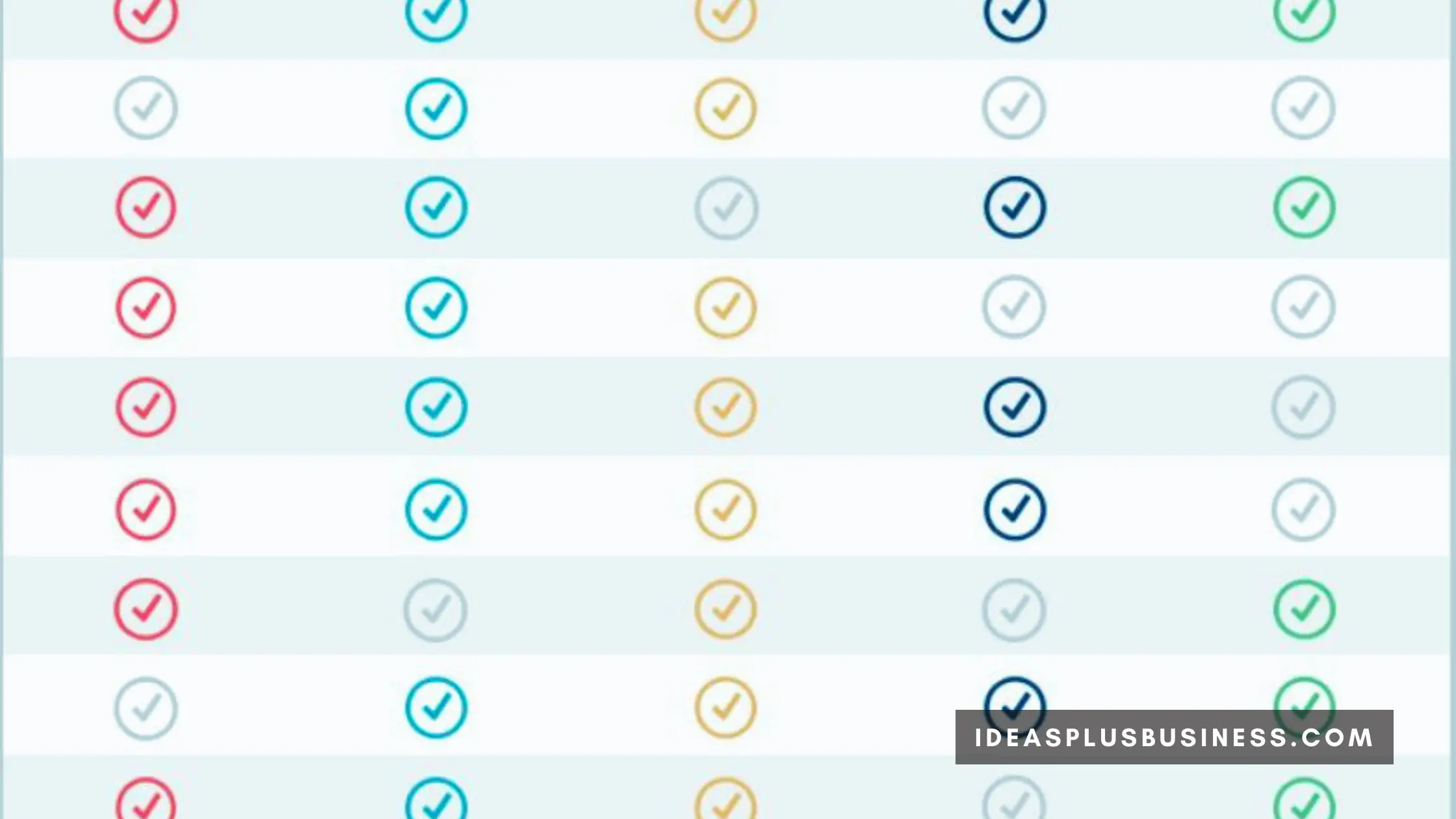
Comparison charts are useful decision-making tools that allow side-by-side analysis of different options based on key attributes. While basic comparison charts have been around for ages, modern templates make it easier than ever to create sleek, organized, and shareable charts that drive informed choices.
In this article, we’ll explore some real-world examples of how businesses, organizations, and even individuals are using creatively designed and thoughtfully constructed comparison charts to weigh alternatives, simplify complex decisions, and support stakeholders.
Comparison Charts Real-world Examples
Here are some real-world applications of the different uses of comparison charts for decision support:
1. Comparing Software Platforms
With seemingly endless software solutions for every business need, determining the right platform can be a daunting task.
From CRMs to accounting software, project management tools, eCommerce backends, email marketing services, and more – understanding the relative capabilities, strengths vs weaknesses, and costs across top contending options is critical.
This is where a structured comparison chart template can provide immense value. Software advisors and IT consultants will often leverage charts to demonstrate their impartial, side-by-side analysis based on the most essential criteria relevant to their client.
Key features, scalability, ease of use, integrations, implementation timelines, customer support access, and costs can all be directly compared. Beyond simplifying platform evaluations, these charts serve as lasting reference documents for decision-makers weighing the recommendations.
To maximize effectiveness, technical experts aim to limit criteria to the 8-12 variables most critical to the client’s overarching business goals. For example, optimizing sales funnel velocity may center chart criteria around CRM integration capabilities, mobile accessibility, and email marketing automation strengths.
Chart selectivity focuses stakeholder attention on core needs without superficial feature overload.

2. Product Research and Purchases
Whether it is researching which laptop, vehicle, appliance, electronic gadget, or other big-ticket consumer purchase to invest in, comparison shopping has become the norm.
As online and big box retailers continue to expand inventories, product specification overload can lead to choice paralysis. Copying and pasting relevant stats between browser tabs simply becomes unwieldy after a while.
Instead, savvy shoppers are using Excel or web-based comparison chart templates to neatly organize product models by key attributes, from physical specs to warranties. Once the top options are charted out for easy visual side-by-side analysis, the buying decision often becomes clear fairly quickly.
Beyond personal use, consumer websites and publications will also rely on charts to provide product recommendation advice tailored to their readers’ needs.
When making major purchases, buyers aim to strike the right balance between relevant technical specifications and overall value perception. Over-indexing on physical metrics alone can sometimes distract from a more holistic assessment accounting for subjective impressions spanning design appeal to brand trust to accessory bundles and beyond.
The most effective comparison shoppers don’t just look at product specs. They also use ranking systems that assign weights to factors like expected durability, appearance, brand reputation, reviewer recommendations, and other things that impact overall customer satisfaction. Scoring products across technical and subjective dimensions delivers a balanced verdict.
3. HR Policy and Benefits Benchmarking
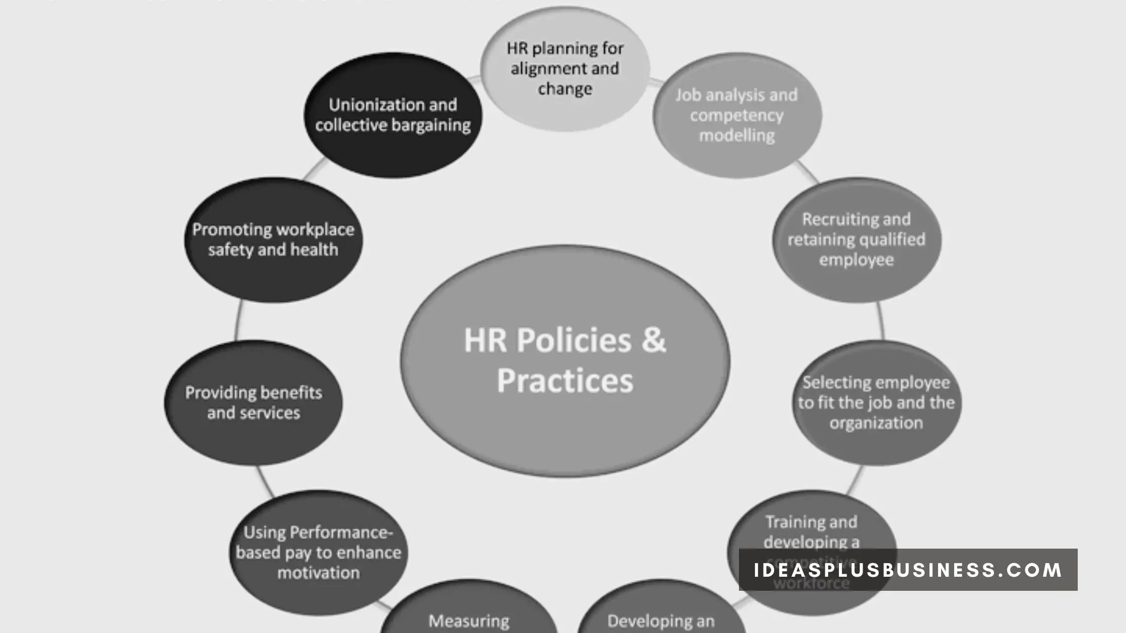
Human resource professionals have a vital responsibility to structure competitive employee compensation, benefits policies, and work-life programs that attract and retain top talent. Conducting periodic benchmarking against peer institutions ensures offerings remain up to date.
While informal surveys have long been employed, using formal comparison chart templates when benchmarking HR policies streamlines the process. HR can select parameters like paid leave, health insurance contributions, retirement matching, bonuses, flexible scheduling, tuition assistance, office perks, culture, and more across a range of comparable organizations they aim to match or exceed in appeal to candidates.
Charts help standardize benefit policy data for easier analysis of where current offerings may be lagging competitors, need adjustment, or can be maintained. Presenting updated recommendations to executives backed by clearly mapped benchmark comparisons also speeds consensus and buy-in for any policy changes HR aims to enact.
When executing compensation and policy benchmarking, HR leaders rightfully prioritize direct competitors to ensure talent attraction parity. However, additional insights can be gleaned from exploring best practices beyond immediate peer companies as well.
Startups and leading tech giants in particular are renowned for progressive benefits aimed at workforce retention and burnout reduction.
Forward-looking HR strategists analyze charts spanning both head-to-head competitors along aspirational employers known for talent attraction despite differences in size, sector, or business model. The separate comparisons reveal both competitiveness floors as well as opportunities to creatively differentiate offerings.
Supporting a rising tide of improved mental health support, career development investments, equitable leave policies, flexibility schedules, and holistic wellbeing offerings serves both employee needs and strengthens employer brands long term.

4. University Comparison for Student Recruitment
Prospective students today are overloaded with options when examining where to apply and ultimately attend college. Between public and private institutions, large university systems, small liberal arts colleges, community colleges, trade schools, and more – the choices are endless.
Simplifying and codifying application considerations for students has become pivotal in higher education student recruitment funnels.
Admissions and recruitment teams actively create detailed comparison chart templates framing key decision drivers for prospective students comparing college options. Factors like cost, academics, student life, campus setting, size, retention and graduation rates, career outcomes, notable alumni, recognitions, and more are summarized side-by-side for top competing school choices.
These charts distill options down to objective parameters rather than just marketing language, photos, and stories. The simplified and structured decision support assists students in determining both initial application strategies as well as final enrollment selection. It continues providing value for counselors advising prospects throughout the admissions process as well.
When building comparison charts for prospective students, recruitment aims for 12-15 variable columns capturing a holistic snapshot of academic, campus culture, outcomes, and affordability factors.
Presenting data in too piecemeal a fashion risks losing student attention. However, condensing factors down too severely overlooks nuanced differentiators between university options. The final framework aims to broadly reflect the overall experience.
5. Nonprofit Funding and Partnership Options
From crowdfunding campaigns to grant applications to sponsorship requests, nonprofit organizations regularly need to pitch supporting partners for varying funding needs. However, all potential supporters are not created equal.
Beyond financial backing, partners can provide volunteers, in-kind donations, media amplification, network connections, operational resources, and other forms of assistance.
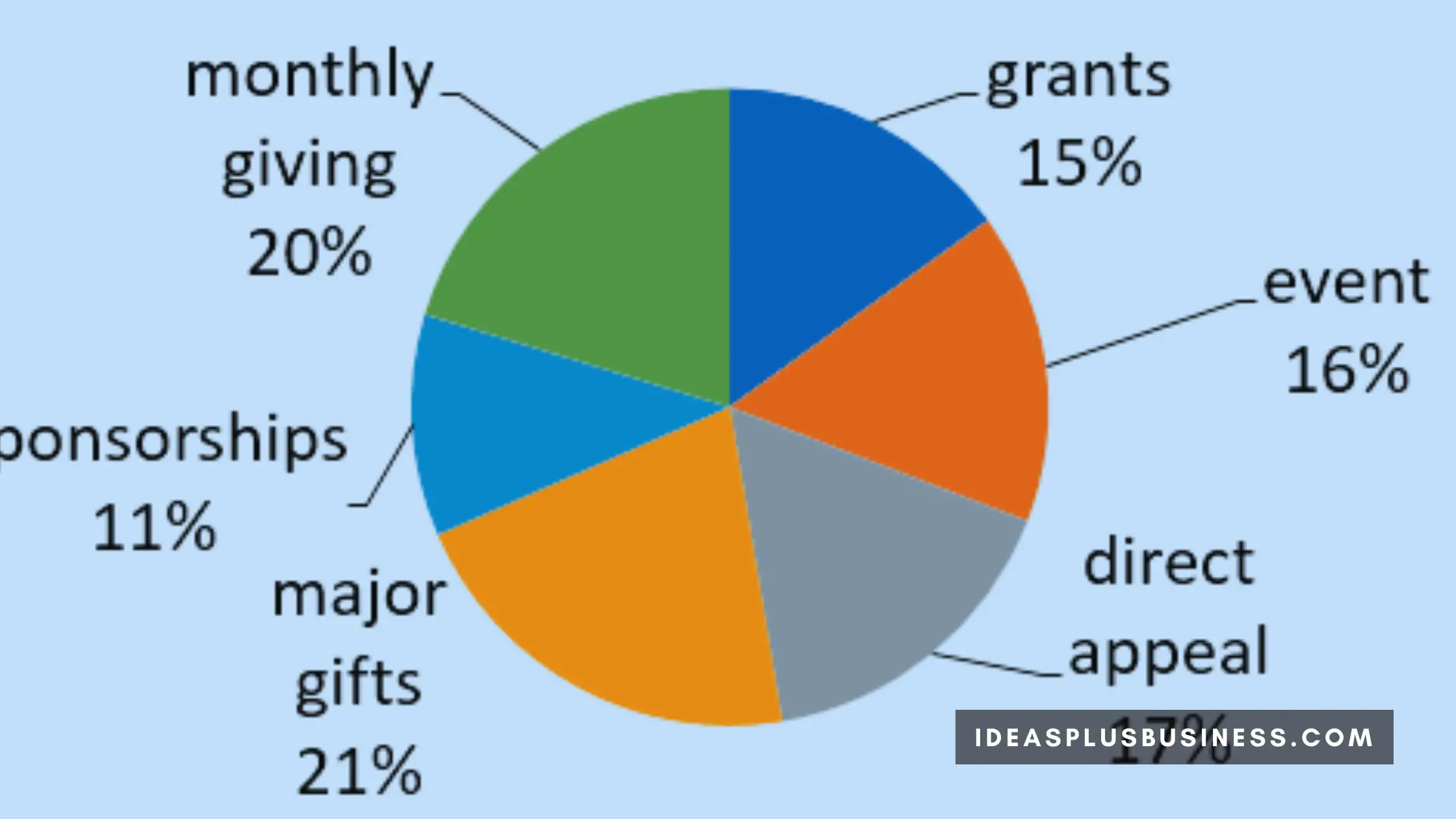
Nonprofits often track supporter types and targets in lists or catalogs for internal reference. However, consolidating key potential partners into a structured comparison chart provides another layer of actionable decision support. Variables like nonprofit mission alignment, impact potential, cash vs in-kind support, application requirements, funding cycle timing, and more can be tracked.
Updated continuously, these living documents help nonprofits thoughtfully prioritize pitches and customize requests.
When an urgent new need or opportunity arises, consulting the supporter comparison chart allows nonprofits to quickly identify which prospects to approach first based on variables like funding size, cycle times, or relatedness to the request at hand. Keeping supporter intel organized for review accelerates opportunistic funding while strengthening long-term partnerships through better-matched appeals.
Incorporating qualitative measures into supporter comparison frameworks – such as a passion for the cause, personal connections, influence capacity, volatility risk, and other factors – allows nonprofits to structure partnerships strategically beyond short-term cash targets alone.
Holistic tracking of both quantitative and emotional variables tied to key supporters enables resilient, sustained funding pipelines.

Conclusion
Structured comparison charts will never replace final human intuition and judgment calls. However, in an increasingly complex data landscape, they remain a vital pre-work tool to organize options, define relevant criteria, surface priorities, spark insights, and guide stakeholders toward informed decisions backed by research.
Beyond the standard product vs product purchasing scenarios, innovative organizations and savvy professionals are also applying comparison chart templates to advance complex B2B software evaluations, consumer research, internal policy benchmarking, recruitment funnels, nonprofit partnership sourcing, and more.
The right parameters, a well-designed layout, and updated data render straightforward but powerful decision support.

I am Adeyemi Adetilewa, an SEO Specialist helping online businesses grow through content creation and proven SEO strategies. Proficient in WordPress CMS, Technical Site Audits, Search Engine Optimization, Keyword Research, and Technical Writing (Portfolio).
Founder and Editor-In-Chief of Ideas Plus Business Magazine, an online business resource for entrepreneurs. I help brands share unique and impactful stories through the use of public relations, advertising, and online marketing. My work has been featured in the Huffington Post, Thrive Global, Addicted2Success, Hackernoon, The Good Men Project, and other publications.
